
Adventures in Vexillology
I live in a country, a pretty small country in fact, that has a really bad flag. I mean this not in terms of what it means or stands for and all that, but in terms of design. I’m talking about the flag of Slovenia, which not unlike the psyche and history of the place itself, is a melange of trying to hide from the world whilst holding on to something that is uniquely it.
I see this thing a bunch because I not only live here, but in the capital, not far from many government buildings and I have a tattoo I regret that incorporates bits of it.

You may notice that it looks just like the flag of Slovakia which of course is half of the same word to begin with, as well as the flag of Russia. As in same damn stripes. Bad design choice, especially lately in terms of recent invasions and world events and what not. If you ask me, colours do run and change and embarrass.
This always bothered me. I was originally a graphic designer and surely even I could do better than a stripe combo a bunch of other, bigger countries have with a little, different shield on it right?
So I finally, after years of internal debate and inspired by comments by an amazing Slovenia graphic design Tomato Košir that a flag needs to not just be a symbol but needs to function as good and differentiated graphic design. It needs to be recognised and read instantly and at a distance or in microscopic, chat avatar sizes. He mentioned in the same interview the Canadian flag does this terribly well, to which I wholeheartedly agree. A leaf. Loads of meanings can be construed, and there is a load of maple up there and who doesn’t love maple syrup right? Winning on all accounts.

You can see a bunch of proposed versions on this (actual) vexillology page, where you can see how people think about flags.
So here’s your new flag.
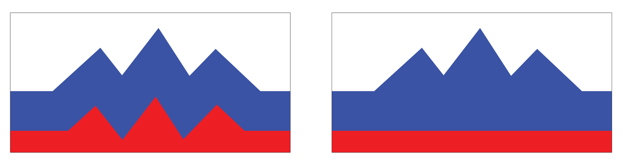
I couldn’t decide on which one, yet had something like this in my head for ages. So this is hard actually. Really hard is what I’m saying. You have this idea of how you could do better and then you get this.
Oh wait, not so sure about symbology myself either. And that’s the thing, you sort of either need to be positive or just let it be what it is and let the meaning come to the symbol. If Slovenia is awesome, therefore the flag should be as well by association one would imagine. And this is the point really. We’re given these symbols, these bits of rectangular (or in the case of the Great State of Ohio, pendant) cloth and people argue, kill and die over this. It’s a symbol, not to be taken lightly maybe, but maybe they should.